Selecting the right color palette is a crucial aspect of any project, whether it's for web design, branding, interior decoration, or any creative endeavor. Colors influence perception, evoke emotions, and can even inspire action among an audience. Understanding how to choose the perfect color palette can significantly enhance the visual appeal and effectiveness of your project.
Understand Color Theory
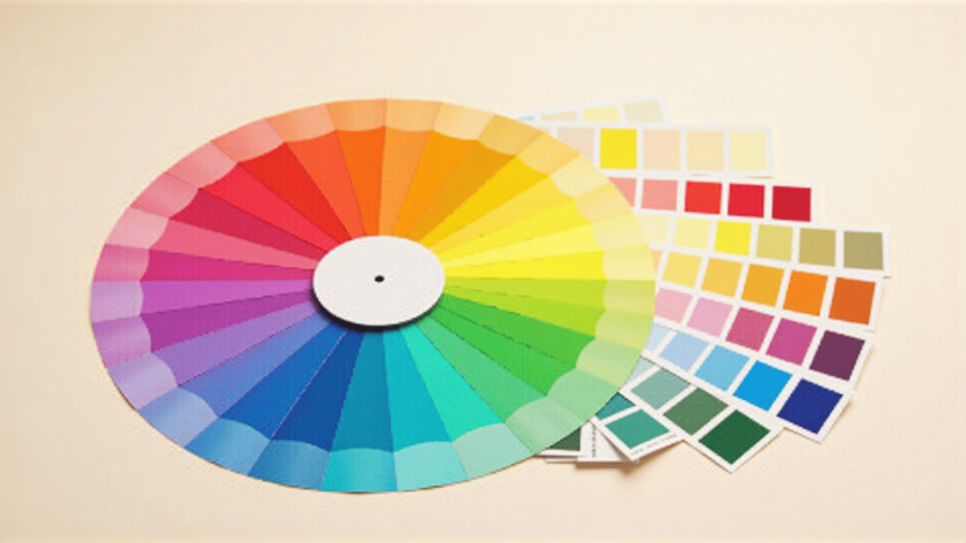
Start by familiarizing yourself with the basics of color theory. This involves understanding the color wheel, which consists of primary colors (red, blue, yellow), secondary colors (green, orange, purple), and tertiary colors (combinations of primary and secondary colors). The relationships between these colors can guide you in creating harmonious palettes. Complementary colors (those opposite each other on the color wheel), analogous colors (those next to each other), and triadic colors (three colors evenly spaced on the wheel) are excellent starting points for creating a balanced palette.
Define Your Project's Purpose
Before diving into colors, it's essential to define the purpose of your project. Different colors evoke different emotions and responses. For instance, red can convey passion and urgency, while blue often represents calmness and trust. Consider the message you want to convey and the feelings you want to evoke in your audience. A corporate website may benefit from blues and greys for a professional feel, whereas a children’s brand might use bright, vibrant colors to attract youthful attention.
Consider Your Target Audience
Who is your intended audience? The demographics of your target audience should significantly influence your color choices. Cultural perceptions of color vary widely—red might signify good luck in one culture while suggesting danger in another. Similarly, age can influence the impact of color; younger audiences typically respond to bold, bright colors, while older demographics might prefer more subdued palettes. Conducting market research can provide deeper insights into the preferences of your target audience.
Create a Mood Board
Building a mood board can help visualize your ideas and see how different colors work together. Gather inspiration from various sources like nature, art, photographs, or existing designs that resonate with your project’s theme. Use these inspirations to experiment with different color combinations to find those that truly capture the essence of your vision.
Utilize Color Psychology
Color psychology studies how different hues impact human behavior and decision-making. Leveraging these insights can enhance the effectiveness of your color palette. Yellow, for example, is associated with energy and optimism, making it suitable for materials meant to invoke happiness. Green often denotes health and tranquility, perfect for projects related to wellness or the environment.
Test Your Palette
Once you’ve narrowed down your potential palettes, testing them is crucial. Create mock-ups or prototypes using the colors in your short list. Observe how they look in different contexts and how they complement or contrast with other elements of the design. Pay attention to readability, especially if your project involves a lot of text, ensuring there is enough contrast between text and background colors.
Flexibility and Re-evaluation
Be prepared to adapt and re-evaluate your choices as the project progresses. External feedback can provide fresh perspectives and highlight aspects you might not have considered. Trends also change over time, so ensuring your palette remains relevant is key. Yet, maintaining a timeless element can ensure longevity and sustainability in your color decisions.
Utilize Tools and Resources
There are numerous online tools available to assist in selecting a color palette. Websites like Adobe Color, Coolors, and Canva offer functionalities for generating and testing various color schemes. These tools can help you visualize combinations in real-time and offer suggestions on popular or trending palettes that may align with your project's goals.
Choosing the right color palette is both an art and a science. It requires a balance between creative intuition and analytical consideration of how colors function within their context. By thoughtfully selecting your palette, you can enhance the visual appeal of your project and effectively communicate your intended message to your audience.